Introduction
Landing page examples that convert can make or break your small business’s online success. Building a landing page is simple with today’s tools, but crafting one that turns visitors into leads or customers? That’s where strategy comes in. For small businesses, every click counts, and a high-converting landing page blends sharp design, clear messaging, and irresistible calls to action (CTAs).
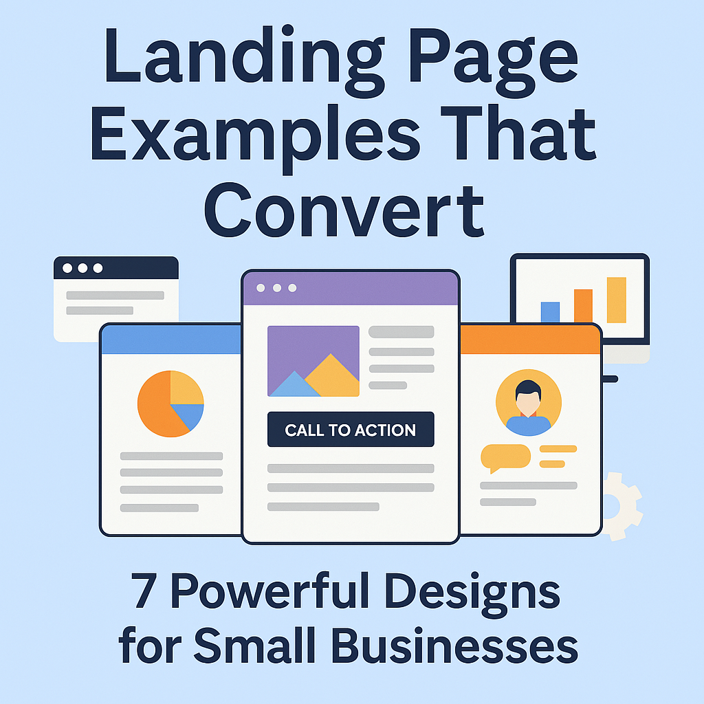
In this post, we’ll explore 7 powerful landing page examples that actually work. Whether you’re selling products, booking appointments, or offering free quotes, these designs will inspire your next upgrade. Let’s dive into what makes them tick and how you can apply these lessons in 2025.
Why Landing Page Examples Matter
Landing page examples aren’t just eye candy—they’re blueprints for success. Unlike a generic homepage, a landing page has one job: to drive action. That could be a sign-up, a purchase, or a booked call.
According to Unbounce, the average landing page conversion rate is 4.02%, but top-tier pages hit 11.45%. The secret? Intentional design and strategy. For small businesses, studying landing page examples can unlock higher leads and sales without breaking the bank.
What Makes a Great Landing Page?
Before we jump into our landing page examples, here’s what every high-converting page needs:
- A bold, specific headline
- A single, focused goal
- Eye-catching CTA buttons
- Visuals that reinforce the message
- Mobile-friendly layout
- Social proof (testimonials, reviews, badges)
Now, let’s break down 7 landing page examples that nail these elements.
7 Landing Page Examples That Convert
1. Adwebify – Website Quote Request Page
- Industry: Web Design
- Goal: Quote Requests
Why it works:
- Headline promises instant value
- Short, simple form
- Clean, trustworthy design
- CTA pops on desktop and mobile
Link: Adwebify Quote Page
2. HubSpot – Free CRM Landing Page
- Goal: Sign-Ups
What’s great:
- Headline hooks with a clear benefit
- Features listed above the fold
- Multiple CTAs with unified messaging
- Live chat boosts engagement
Link: HubSpot CRM
3. HelloFresh – First-Time Offer Page
- Goal: Subscriptions
Why it converts:
- Emotional headline grabs attention
- Product visuals are front and center
- Discounts are impossible to miss
- Mobile layout is fast and sleek
Link: HelloFresh
4. Squarespace – Service Launch Page
- Goal: Sign-Ups
What’s smart:
- Minimal design with bold text
- Smooth, readable scrolling
- Case studies add credibility
- CTAs flow naturally
Link: Squarespace
5. Dropbox – Business Sign-Up Page
- Goal: Free Trials
Key takeaways:
- Distraction-free layout
- CTA: “Try free for 30 days”
- Short, punchy benefits list
- Customer logos build trust
Link: Dropbox Business
6. Calendly – Schedule Demo Page
- Goal: Bookings
Why it works:
- Personal touch with team photos
- Low-commitment CTA: “Schedule a Time”
- Mobile performance shines
- Benefits explained simply
Link: Calendly
7. Shopify – Start Your Free Trial
- Goal: Trial Sign-Ups
Highlights:
- Big, bold CTA button
- Real user testimonials
- “No credit card required” eases fears
- Hero image shows the product
Link: Shopify
Lessons from These Landing Page Examples
These landing page examples prove that conversions hinge on clarity and trust. A cluttered page distracts; a focused one delivers. In 2025, small businesses can’t afford to miss out on leads due to poor design or weak CTAs.
Test your own pages with tools like Google PageSpeed Insights to ensure they load fast. Add a plugin like Yoast SEO to optimize content. For more tips, check our blog.
Final Thoughts
Landing page examples like these show what’s possible when design meets purpose. If your site isn’t converting, your landing pages might be the weak link. Use these 7 designs as inspiration to refine your headlines, CTAs, and layouts—or let experts take the wheel.
At Adwebify, we craft landing pages that don’t just look good—they perform. Ready to boost your conversions? Contact us today to build a page that turns clicks into customers.